Residence
A concept design as part of CareerFoundry’s UI for UX Designers course. Residence is a responsive web application that helps first-time home buyers find the perfect property for them.
Context
Real Estate is becoming a popular way for people to achieve financial security. While this is an exciting time, first-time buyers often waste time unsure how to get started or viewing homes that aren’t suited for them. This web app is designed to give these users the help they need to find a great property.
Objective
A responsive web app that provides property buyers with information on properties of interest.
Tools Used
Adobe XD
Photoshop
Role:
UX/UI Designer
Duration:
2 months
Primary Stakeholder:
CareerFoundry UI Course
User Stories & User Flows
As a user, I want to create a profile containing all my property criteria, so that I am recommended results most relevant to me.
As a user, I want to be able to search and filter properties, so that I can find good matches based on my needs.
As a user, I want to be able to save or mark properties I am interested in so that I can easily revisit them.
As a user, I want access to as much written and visual information as possible about properties I’m interested in so that I can make an informed decision.
As a user, I want to see how well a property meets my criteria or compares to other properties so that I can refine my options.
Rashida Lovett
As a designer, it’s important to understand the user’s goals. Rashida, the user persona included in the project brief, was an important part of the process. I kept a list of Rashida’s goals and tasks nearby and referenced them regularly while designing.
User Persona
Rashida is an IT consultant for a growing tech company and is frequently on the go. She is good at multitasking and relies heavily upon technology to accomplish her tasks.
Rashida wants to start investing in property outside of the city for increased financial security for her family. She needs a tool that will help her find the right properties without wasting her time.
“I want to provide for my family with financial security. I’ve been considering buying property for a while, and am looking for a tool that can help me find what I’m looking for, quickly!”
Low-Fidelity Wireframes
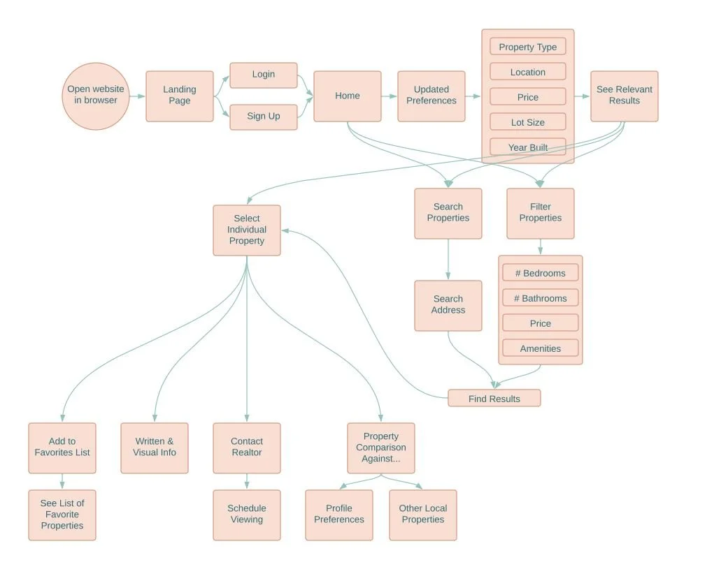
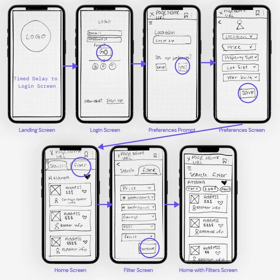
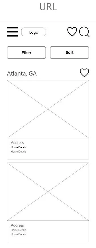
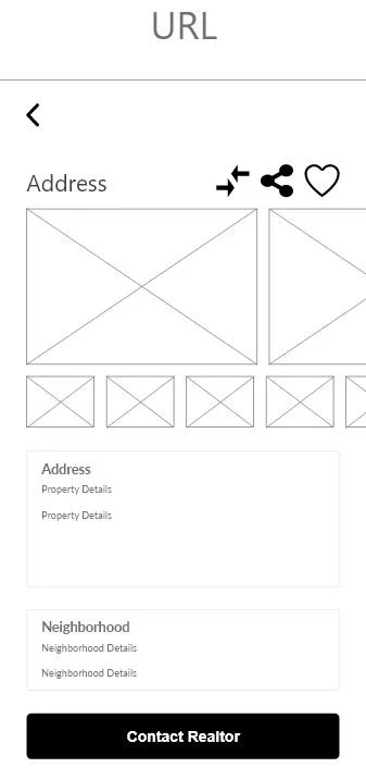
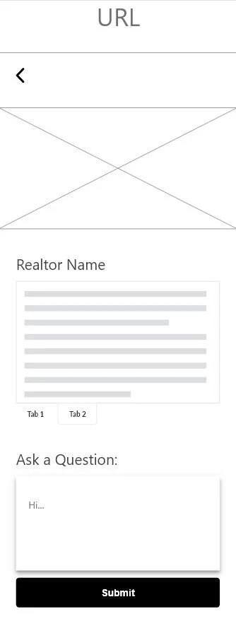
With my user flow in place, I used a pen and paper for rapid wireframing to focus on the functionality of the initial screens. Some of the primary features included the ability for users to log into an account and filter results in a particular area. Once users selected a property to view, they had additional features available including adding a home to their favorites, scheduling a viewing, and comparing the property against specific criteria.
Mid-Fidelity Wireframes
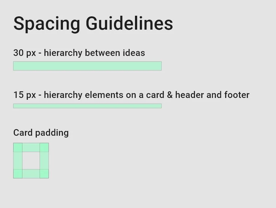
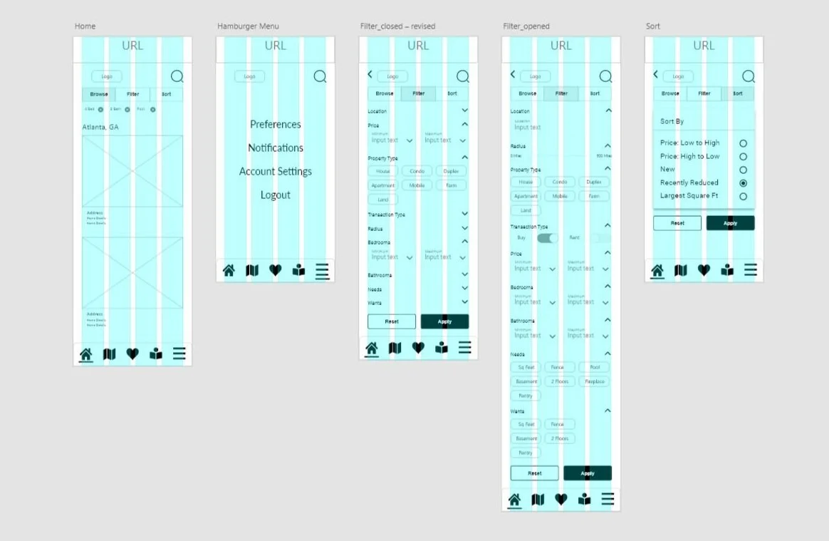
Moving to mid-fidelity wireframes, I began my project in Adobe XD. During this phase, I focused on grids, spacing, and hierarchy.
Mood Board
Establishing a mood board helps to convey the visual direction that the project will take. The keywords (clean, quick, and smart) were taken directly from the project brief and represent the user’s needs. The top-down view of the illustrations may add to the feeling that users are getting a comprehensive bird’s eye view of all choices. The icons are part of the Material Design family and will bring a sense of familiarity to the design.
Style Guide
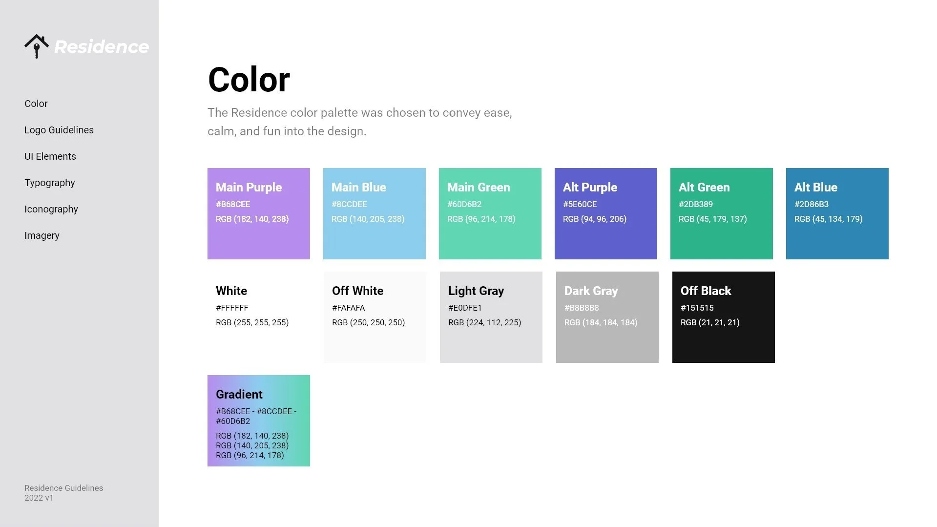
Creating a style guide is an important way to share branding guidelines for a project. I documented color, logo guidelines, UI elements, typography, iconography, and imagery. For a more detailed overview, check out the link to the interactive style guide below.
Mobile Mockups
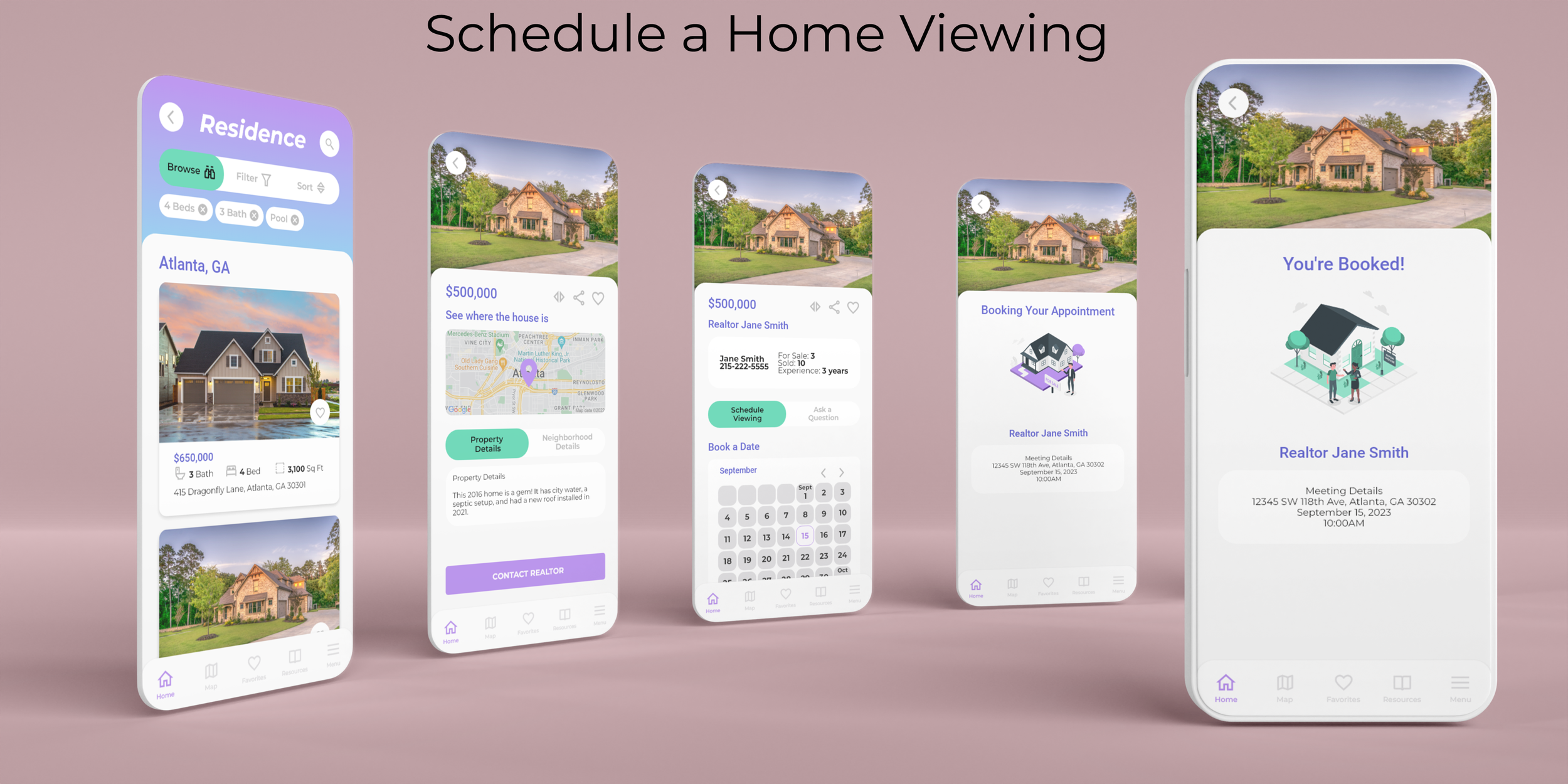
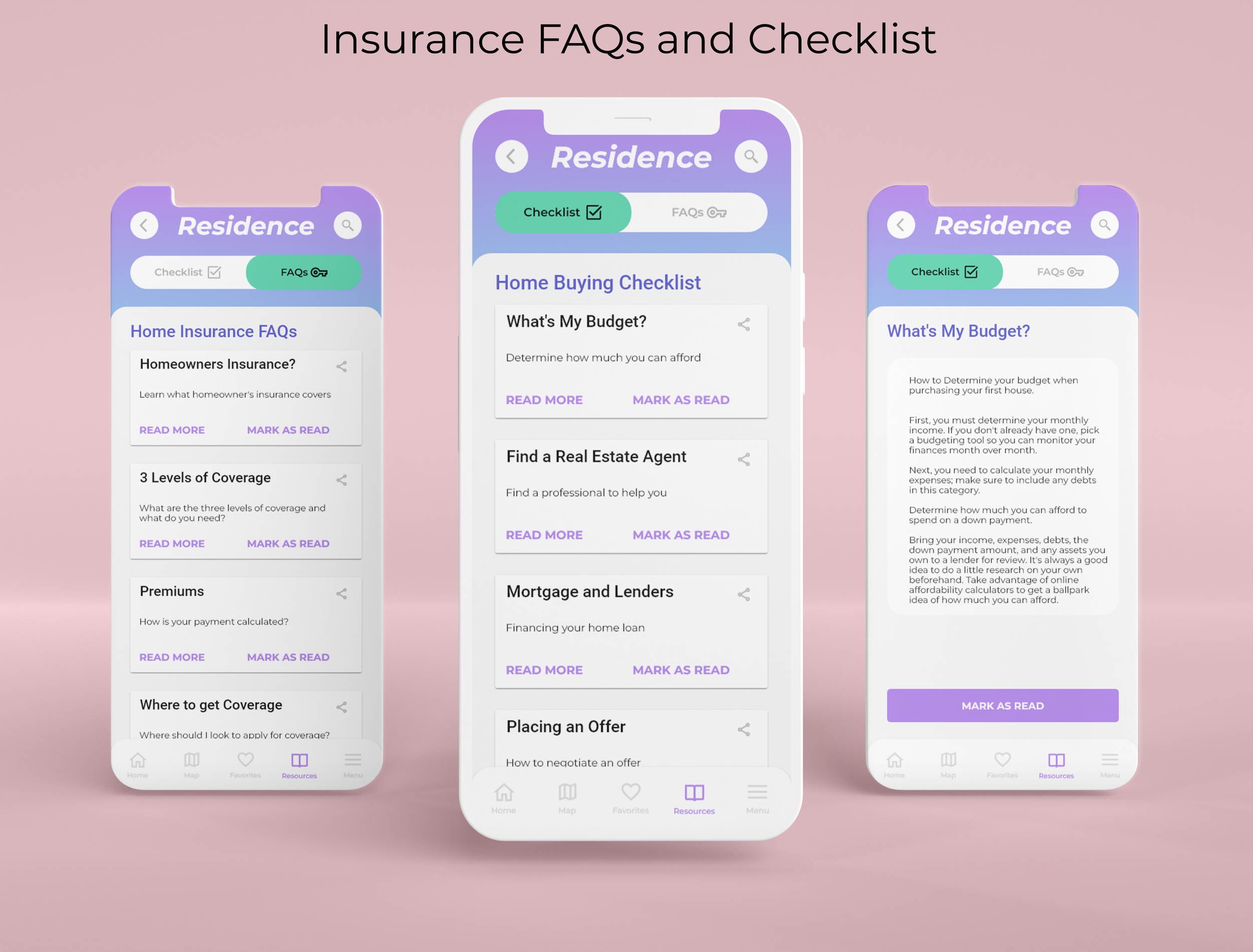
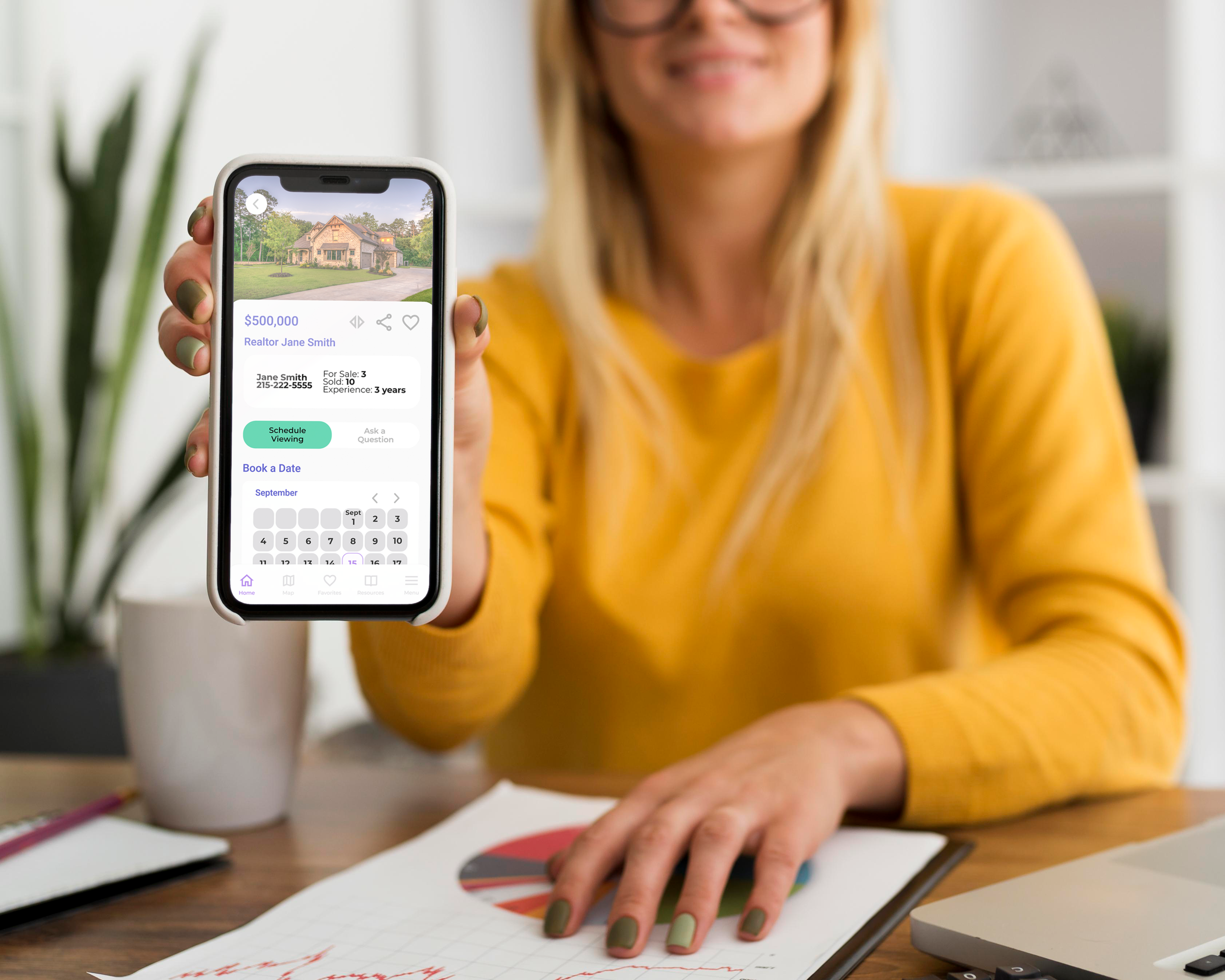
Once my style and branding guidelines were completed, I started working on high-fidelity wireframes in Adobe XD. Through several rounds of iteration, I created the engaging mockups below.
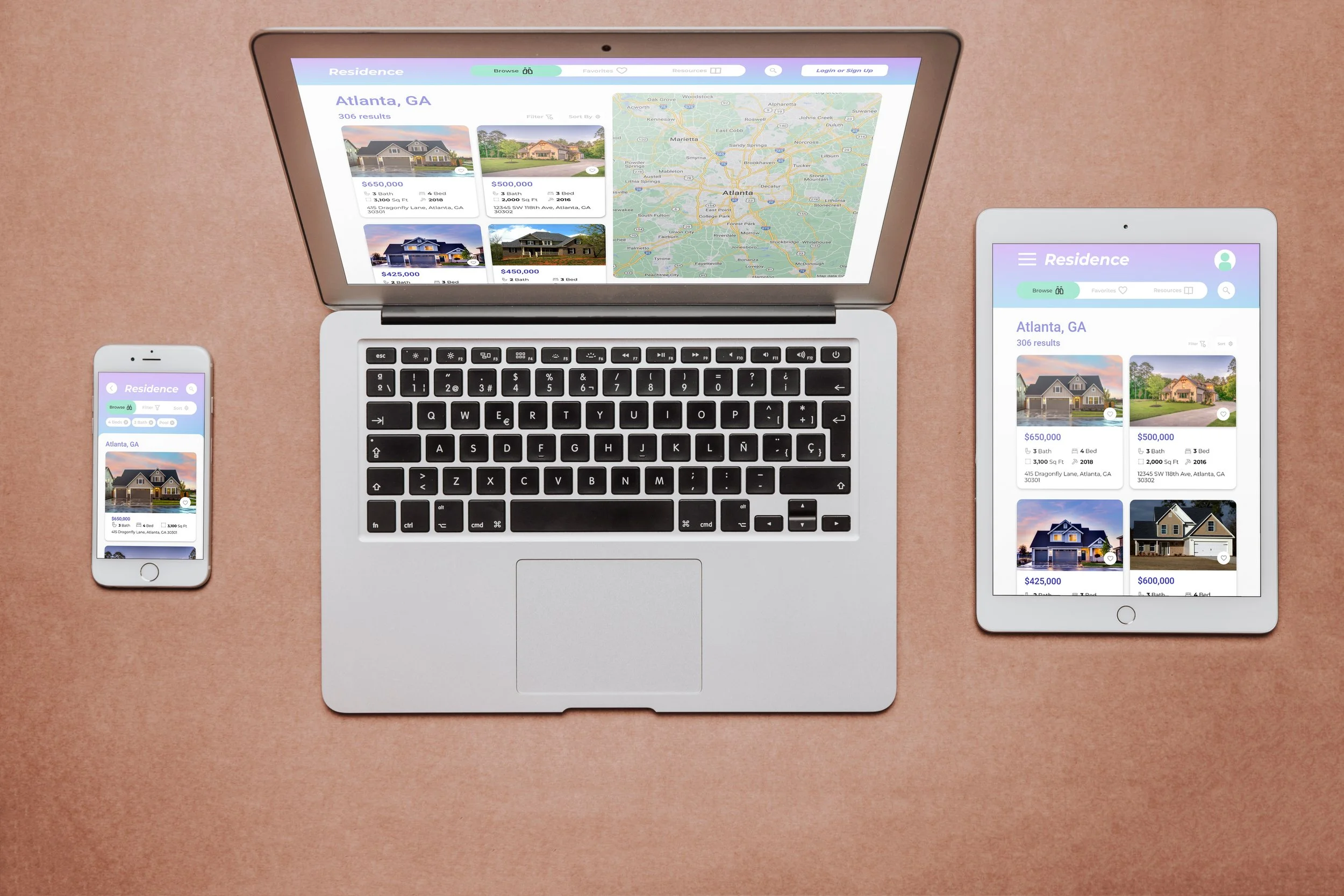
Designing for Breakpoints
Having used a mobile-first design approach, the natural next step was to design content for various breakpoints, making the design accessible to even more users.
Final Prototype
Check out the prototype below!
Retrospective
Working on this project was a great way to hone my UI design skills. Creating Residence allowed me to implement UI and visual design principles.
Because most of the research for this project was already established, I focused on finding my style of visual design. I spent much time perfecting the visual hierarchy, spacing, and grids. In hindsight, I would have liked to spend more time exploring UI design patterns and how to implement them.
Developing branding for this project was the most enjoyable part for me. Defining a visual direction and expressing it through a mood board was an enjoyable part of the process that brought the designs to life!
Next Steps
Perform usability testing to validate design decisions
Investigate further UI design patterns to further improve the product
Spend additional time developing animations
