PandaPay
As a concept project, I designed a money-transferring app that helped users make secure purchases, transfer funds and set reasonable budgeting goals.
What I did:
-
My Role
I designed PandaPay from Scratch. Starting with a basic idea for an app, I researched, designed, and tested the app from start to finish.
-
My Skills
Research
Information Architecture
Wireframing
Prototyping
Usability Testing
UI Development
-
My Tools
Figma
Optimal Workshop
Usability Hub
Google Forms
-
Problem Statement:
People with money-sharing challenges need a secure way to make purchases, transfer funds, and set reasonable budgets in a digital space because the way we manage money is changing.
-
Hypothesis:
I will know this to be true when I see people seamlessly transfer funds, request money, make purchases, and set reasonable budgeting goals with the PandaPay app.
Research:
-
Preliminary Research
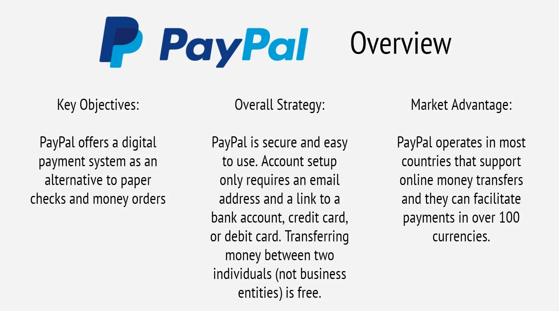
I completed a competitive analysis for two existing money-transferring apps. I researched key objectives, strategy, and market advantages before analyzing usability, layout, navigational structure, and calls to action. With a better understanding of the market, I focused on general business requirements. The target audience, competitors, and risks were identified as well as the scope and functional requirements for the web application.
-
Surveys & Interviews
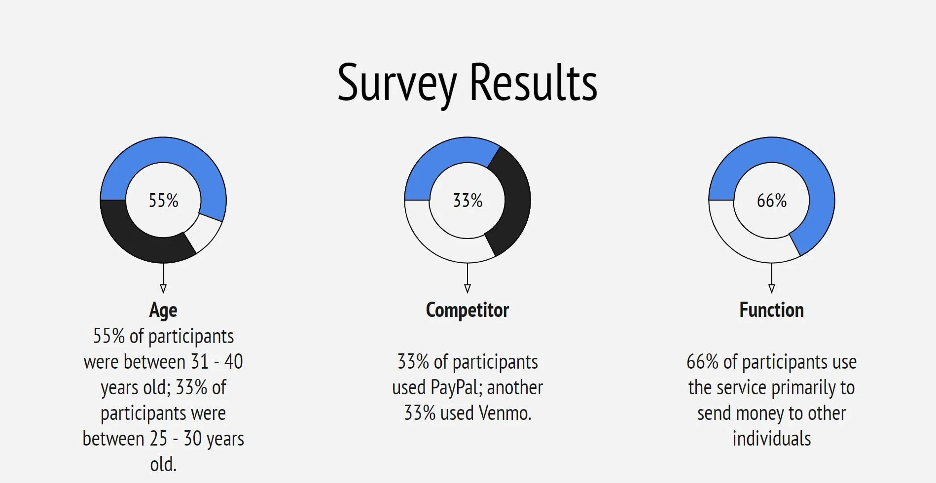
I conducted surveys and interviews to determine which function is used most frequently, which features are most important to users, friction points with existing apps, and users’ feelings about market competitors.
-
Results
The survey and interviews yielded several important findings. Two-thirds of participants stated that the feature they use the most was transferring money to their contacts. 22% of participants said that some features are hard to access and the icon placement should be more intuitive, while 33% of participants shared that their current money-transferring app makes all transactions public by default and that they wanted more confidentiality with their transfers. The biggest point of friction was an unclear or overwhelming interface that doesn’t clearly identify the primary function of the page.
Mobile-First Design:
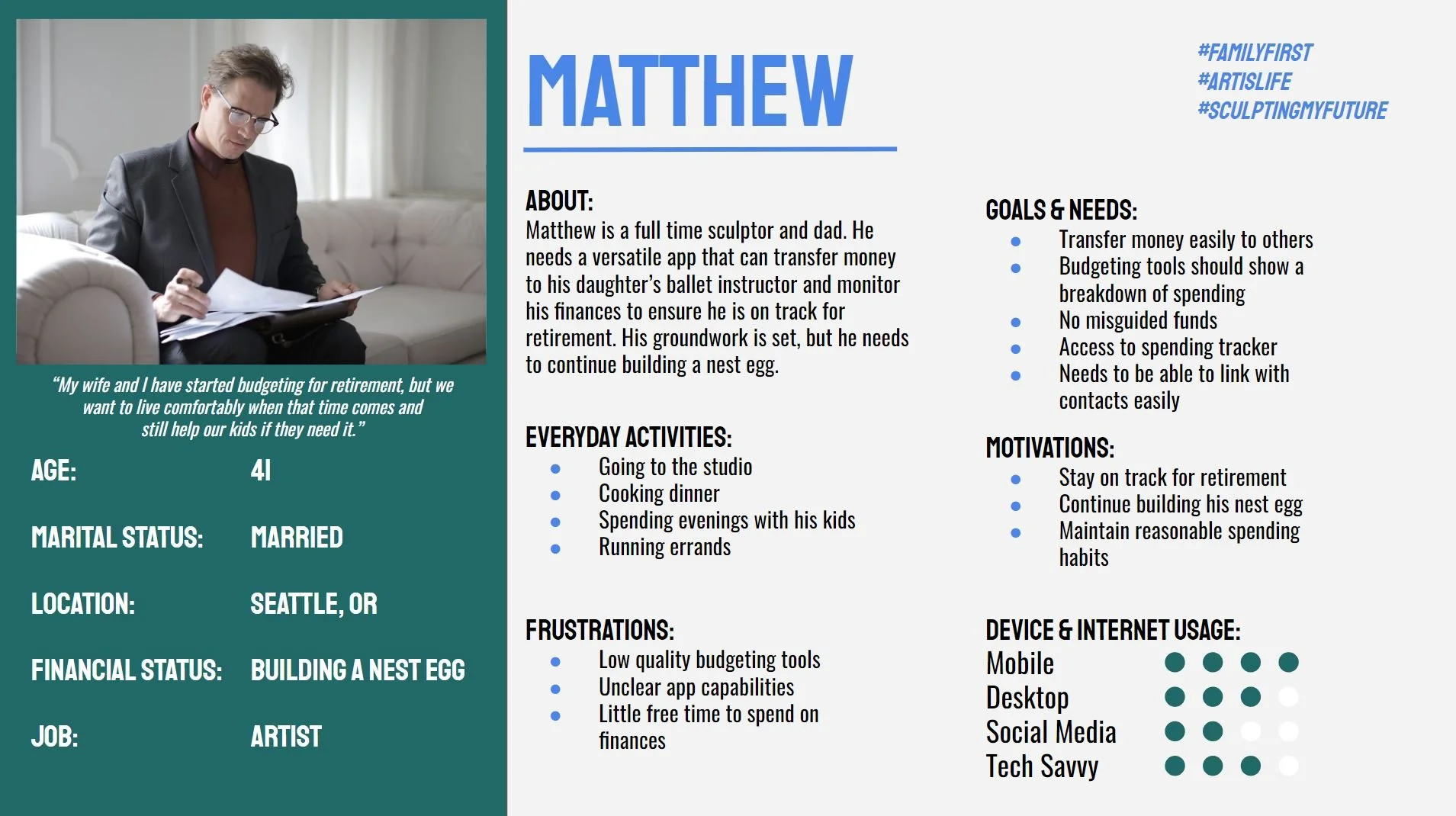
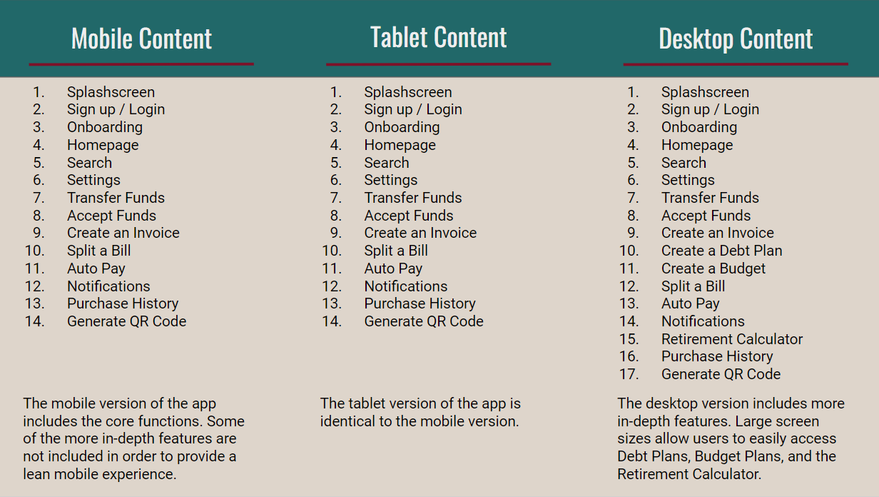
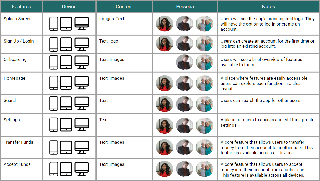
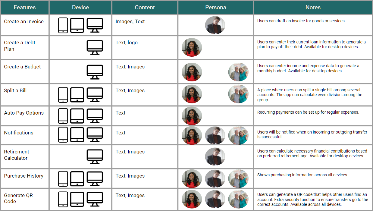
I designed a mobile version of the web application before designing the desktop version. To do this, I organized the content by device type. The mobile device should support the leanest version of the web application, with larger devices expanding in content. Then, I assigned personas to each feature to identify which section(s) of the target audience would benefit from it. Being aware of the different screen sizes that users will employ helped me to decide which complex features to remove from the mobile application.
3D Cluster View
Dendrogram
Revised Sitemap
Card Sort & Sitemap:
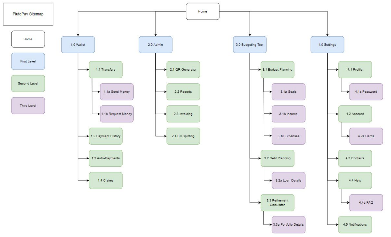
Creating a sitemap helped me to focus on the hierarchy of screens for PandaPay. I created an initial sitemap, grouping features in a way that I thought would be helpful to users. To test my initial app organization, I set up an open Card Sort for potential users to provide feedback.
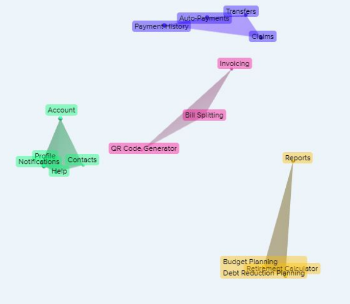
Using the card sort results, I gathered data to inform my sitemap. The data collected from this exercise supported some design decisions of the original sitemap and suggested revisions for others. The participants for this study created a median of four categories, which supports the structure of my original sitemap. Because of this, I decided to keep this aspect of the design.
With the exception of a couple of features, the breakdown was very similar to the original sitemap. There was one feature, however, that was difficult to place. The three budgeting features (budget planning, debt reduction planning, and retirement calculator) were grouped together by participants 100% of the time. The 3D cluster view shows the reporting feature included in this group, though it is noticeably farther from the rest of the features. The dendrogram shows the reporting feature in a similar placement to the QR code generator and bill splitting features. As a result, the reporting feature could be placed in one of those two potential categories.
Because the budgeting features will only be available in the desktop version of the web application, I decided to group the reporting feature with the QR code generator and bill splitting features, keeping it accessible on the mobile version.
Paper Sketches:
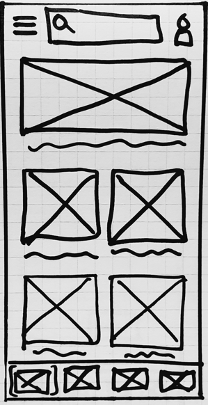
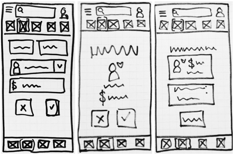
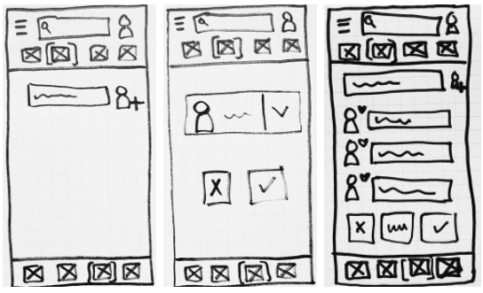
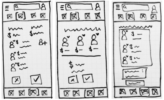
Based on my user flows, I drew low-fidelity wireframes on graphing paper. Pen and paper prototyping allowed me to make multiple versions of a screen very quickly without using lots of time or resources. From my low-fidelity wireframes, I gained a solid foundation to iterate upon, increasing the fidelity each step along the way. Due to the nature of low-fidelity prototypes, I focused on functionality first, saving the details for mid-and high- level fidelity iterations.
Home Screen
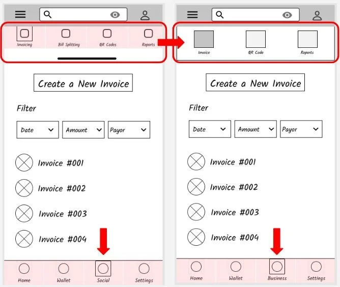
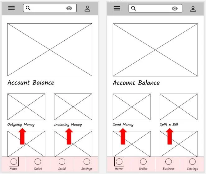
From my competitive analysis, I found that a dynamic home screen gives users the ability to see important data points without having to manually navigate to find them. The home screen I designed features one large element at the top which holds the user’s account balance. The remainder of the screen space is used to show smaller, less important data points. Using mobile-first design principles, I chose to limit the number of elements spanning across the screen to two. This will keep the small screen readable and uncluttered. Users can scroll down on the home screen to reveal the remainder of the dashboard and a customized button that gives users the ability to change and prioritize what information populates when they log in.
Transfer Screens
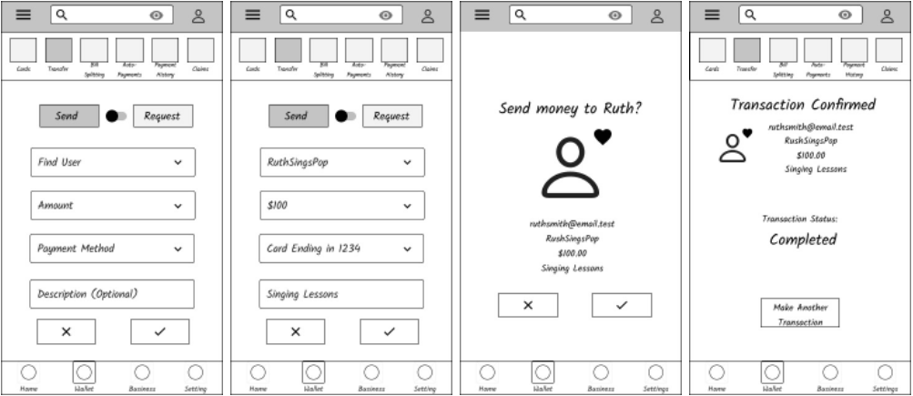
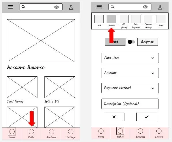
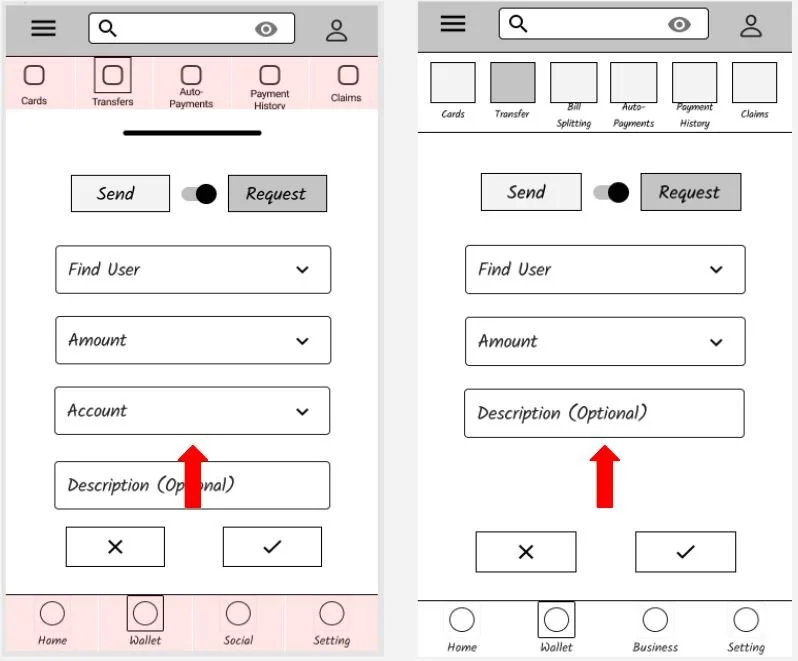
During my user research, I discovered that participants wanted to be able to review their transfers before finalizing them. Because of this, I decided to include a review screen. This screen shows all of the pertinent transfer details and requires the user to confirm the transfer before it goes through. This leads to a status screen that shows users when their transfer moves from pending to complete.
Bill Splitting Screens
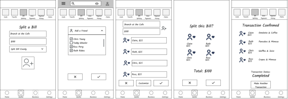
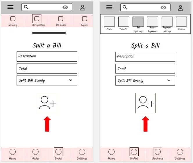
My final set of low-fidelity wireframes exemplified splitting a bill. Similar to the transfer feature, splitting a bill requires at least two inputs: another user and an amount. But this bill needs to be split among multiple users. For this reason, I chose to have the user input each individual in the group as the first step of the task. Once each member of the group is entered on the bill, the final amount is added, and the bill is ready to split. A customizable button allows users to edit each person’s portion of the bill if it shouldn’t be split evenly among the group. To stay consistent among the different features, I included a both review screen and a status screen. This matches the flow of the transfer feature and gives users an idea of what to expect each time they move money within the app.
Low Fidelity Wireframes:
The next step in my process was to increase the fidelity of the wireframes. I chose to transition to wireframing software to convey more details in my designs. Continuing in Figma, I linked these wireframes together to create a clickable prototype.
Transferring Money
Splitting a Bill
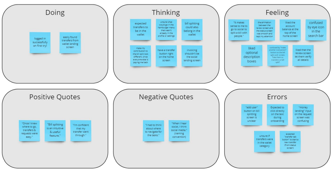
Usability Testing:
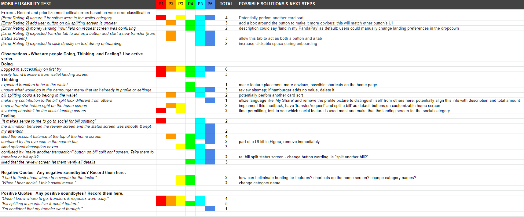
Organizing Data
Actionable Insights & Improvements
High Fidelity Iterations:
Starting with the mid-fidelity wireframes, I went through several iterations of the designs for this project. I created a Style Guide and Pattern Library that yielded many clear visual improvements. Because of this, I was confident in moving into the next phase of the process: peer review. I shared the prototype with other designers to elicit constructive feedback. Collaboration among designers is extremely helpful because it reveals blind spots in the design choices. I analyzed the critiques to see how they would affect PandaPay and chose to implement most of them, creating a more cohesive product with clearer screen hierarchies.
Mockup Templates sources from Freepik
To see the most recent version of PandaPay, check out the interactive prototype below.
Final Thoughts:
-
Retrospective:
I learned a lot while designing this concept project. In the early stages, I was able to practice writing scripts, completing user interviews, and interpret data. These research results fueled the user flows and site hierarchy, allowing me to make design decisions based on data when possible.
Through the process of usability testing, I gained an understanding of some fundamental expectations many users have for their apps. In future usability testing, I will implement as many UI best practices as possible so that I can gain deeper insights during testing. The final improvements to the mid-fidelity screens were based on usability testing data and significantly increased the design’s usefulness.
As I moved to high-fidelity wireframing, I learned the importance of consistency in design; I relied heavily upon my design language system documentation and will implement this tool earlier in the process for future projects. Having a series of guidelines available (for colors, buttons, whitespace, etc.) helped the design take on an element of cohesion that made the different wireframes feel connected.
Each phase in the design process added a different tool into my UX design toolbox.
-
Next Steps:
With additional time and resources, there are many ways that I could continue to improve upon this design.
Collecting data on error rates, task completion rates, and average time spent on a task would help to measure the success of the design.
Researching the possibility of adding the budgeting tools to the mobile app (in addition to the desktop version) would increase the use of those features.
Adding a tip generator and an image input to the bill splitting function would reduce users’ manual input.
By improving contrast between text and images, reassessing whitespace, and giving the search field a different background color instead of a solid border, the UI would be come more visually pleasing. There’s also room to reassess and add higher quality images to the app while refining the PandaPay logo.

